App Store for watchOS 10
UI & VISUAL DESIGNOverview
The vision for watchOS 10 was to create a world of colorful, glanceable, purpose-built apps.
With this in mind, the App Store is first and foremost a marketplace.
While other apps & services could focus on surfacing mobile utility, I didn’t want to design for design’s sake, and instead focused on driving optimization of the core experience for users who may require an app download while on-the-go. In addition to many performance improvements, this release introduced an updated design language, adaptive grid system, and navigation style.
Core Problems to Solve
The UI had overall poor readability without support for dynamic type scaling.
Outdated design language and dull visuals no longer aligned with App Store system.
watchOS 9 had existing performance issues to address on older devices.
Approach
The App Store team was planning to roll out a visual update across core editorial surfaces.
But at this point, the team roadmap had only carved out engineering resources for iOS & iPadOS. My plan was to bring watchOS into alignment where it made sense, and balance platform design vision with our internal updates.
Objectives
Implement platform wide navigation & grid updates.
Improve performance by scaling back custom UI.
Prioritize legibility and support for accessibility settings.
Improve overall appeal of editorial surfaces
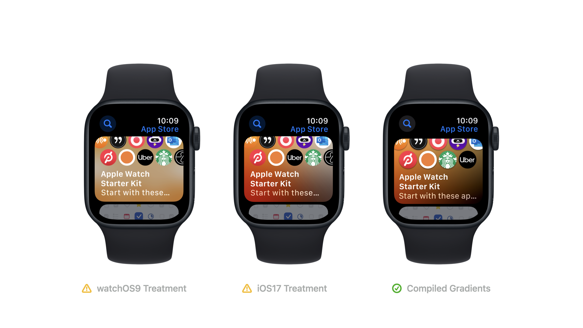
I began to apply the working visuals on watch; however, the graphic effect was actually slowing devices significantly. We couldn’t rely on the same effects, nor could we keep the older POR. I needed to create an entirely new system that would align within the others.
I nixed the visual’s reliance on heavy background blurring, and outlined a dynamic color treatment. I used a media API to generate simple swatches sourced from app icons and created variable gradient patterns for different card variations. When combined with a protection layer determined by overall card luminance, we were able to achieve a richness and depth of color, without cost to perf or legibility.
Launched
October 2023
Internally, we felt these updates were a huge win — allowing us to achieve a more vibrant surface, while also scaling back on engineering LOE. By cutting unnecessary custom UI, we were able to add in soft transitions and animations, while improving overall readability, and visual appeal. Switching to the new grids also provided a quick auto-layout across all iOS17 eligible devices, including the new Ultra 2 model.


